Lloyds Bank. Bringing a traditional brand to life across digital.
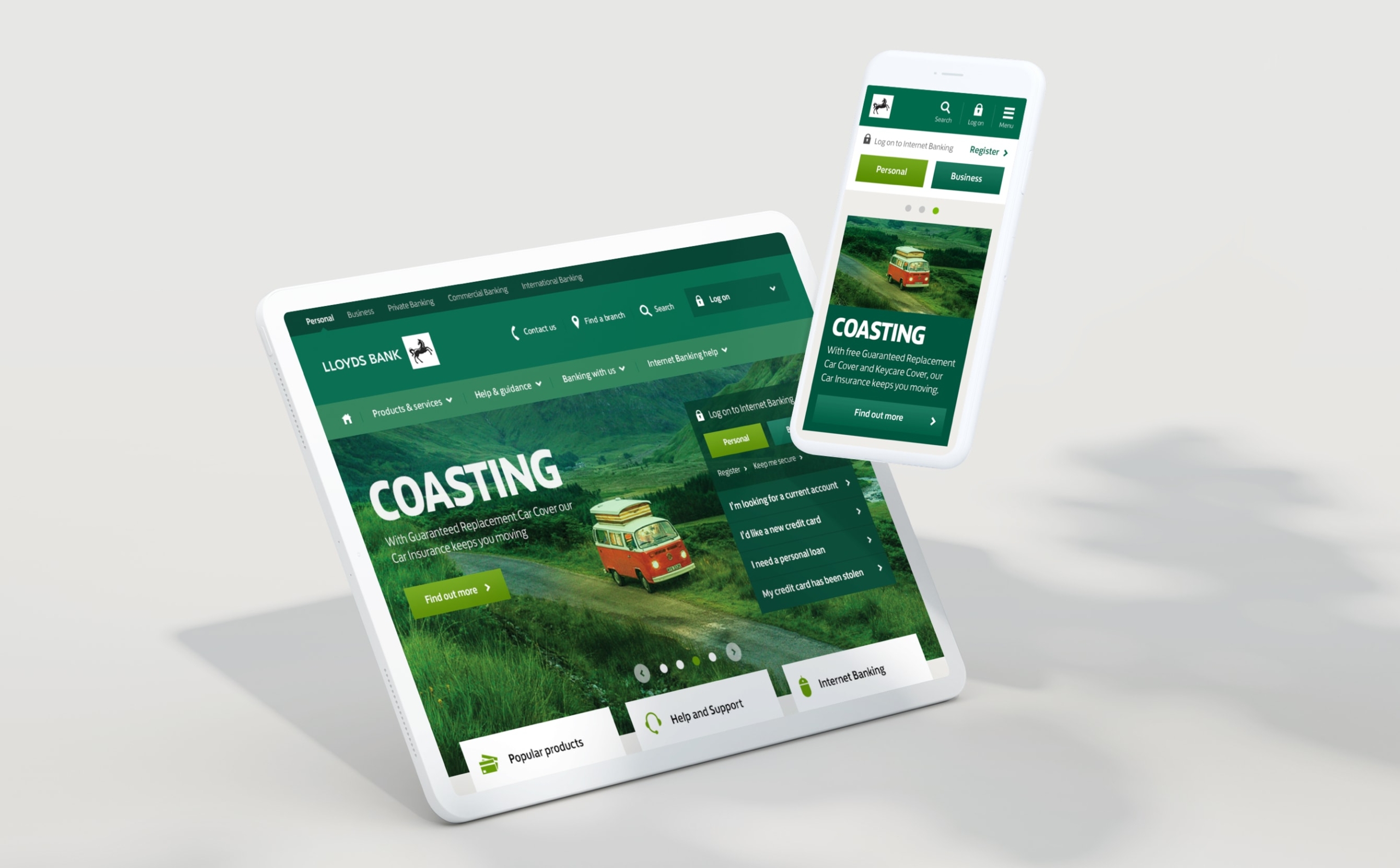
Client
Lloyds Bank
Role
Design Director
Output
Design Direction
UX/UI
Overview
Considered an iconic British brand, with a rich heritage and strong association with traditional banking values, Lloyds Bank has established itself as one of the UK’s leading retail banks.
With a fresh new marketing rebrand, the challenge was to translate the new look and feel the digital platform.
As design director I was responsible for leading the design direction and establishing the principles and standards that would be used as a basis for current and future Lloyds Bank digital propositions.
Reworking the brand for digital
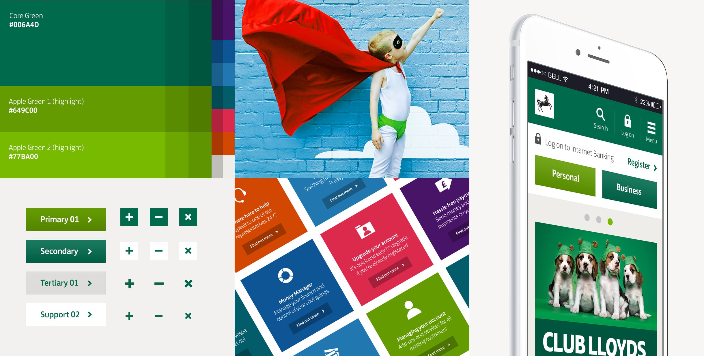
Through a discovery phase we immersed ourselves in the brand, learning about the new brand personality and creative principles. From this we created the design foundations, adjusting colours for accessibility, defining the use of typography, iconography, image styles and interaction, to express the confident, vibrant and flexible brand characteristics, and long-held ‘visibly green’ association.
Redesigning Lloydsbank.com
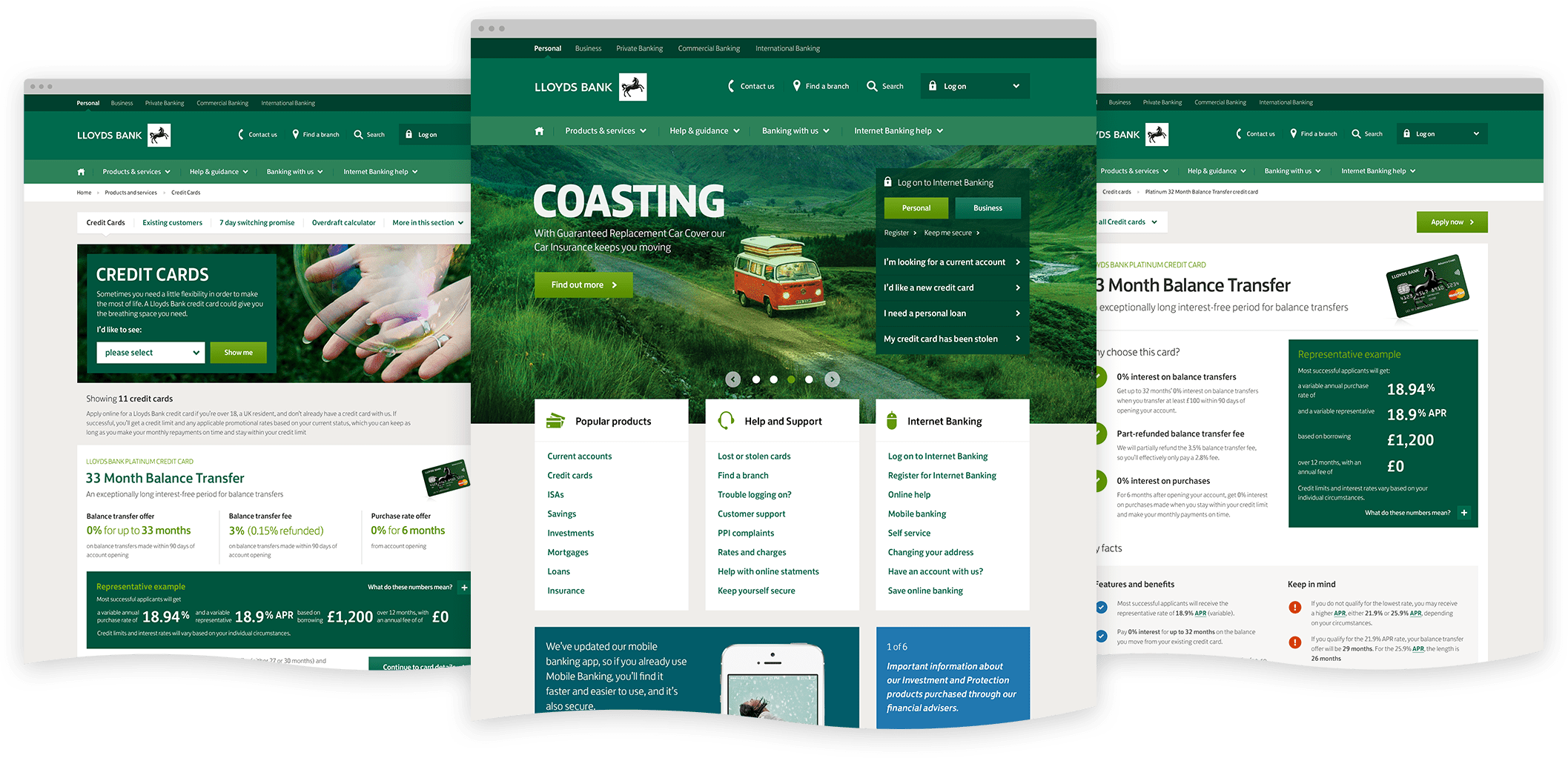
Using an agile process, split into sprints, I oversaw the visual design direction, taking the design foundations from the discovery phase and applying it to the new website.
The core design team working on lloydsbank.com consisted of UX designers, developers, copywriters and content strategists alongside business stakeholders. As a team we redesigned the website from the ground up, reworking the navigation and information architecture, and mapping out new end-to-end journeys which we prototyped and validated through moderated user testing with Lloyds Bank customers.
Optimising across devices
As a team we took the business stakeholders on a journey, educating them on responsive design and demonstrating how different devices and screen sizes impact how customers view and digest content.
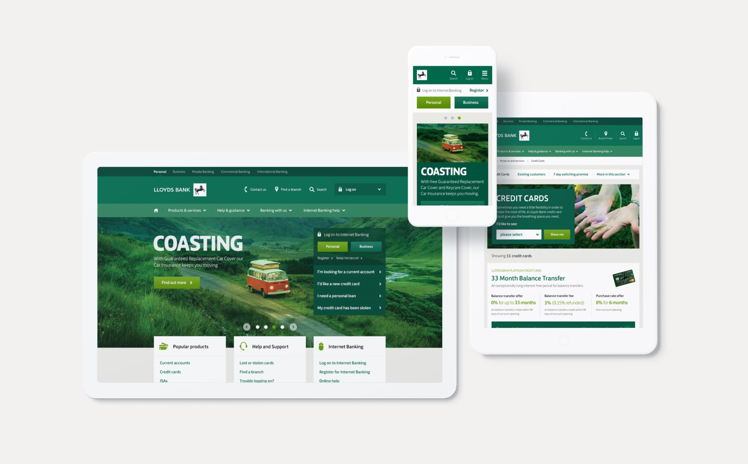
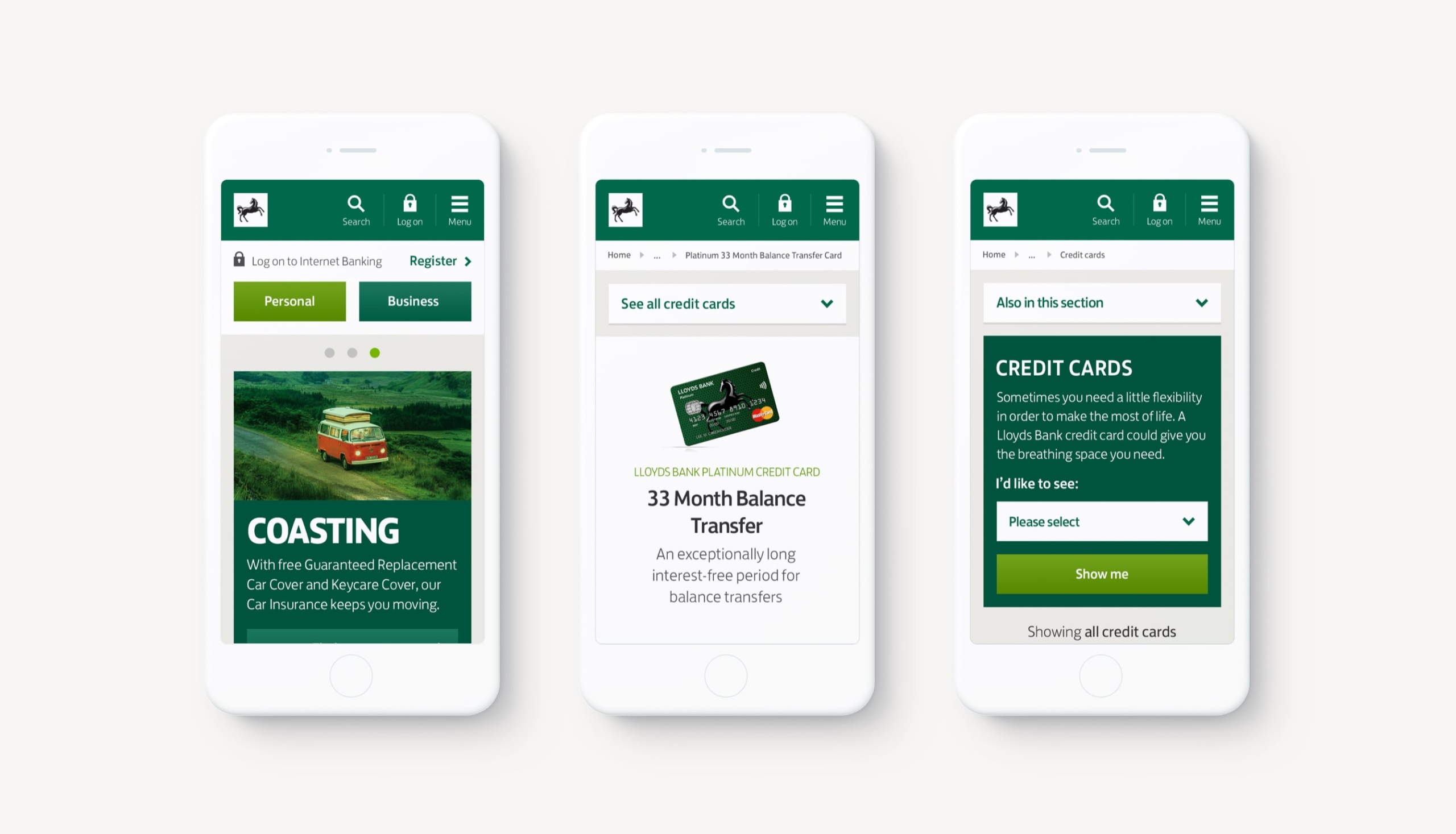
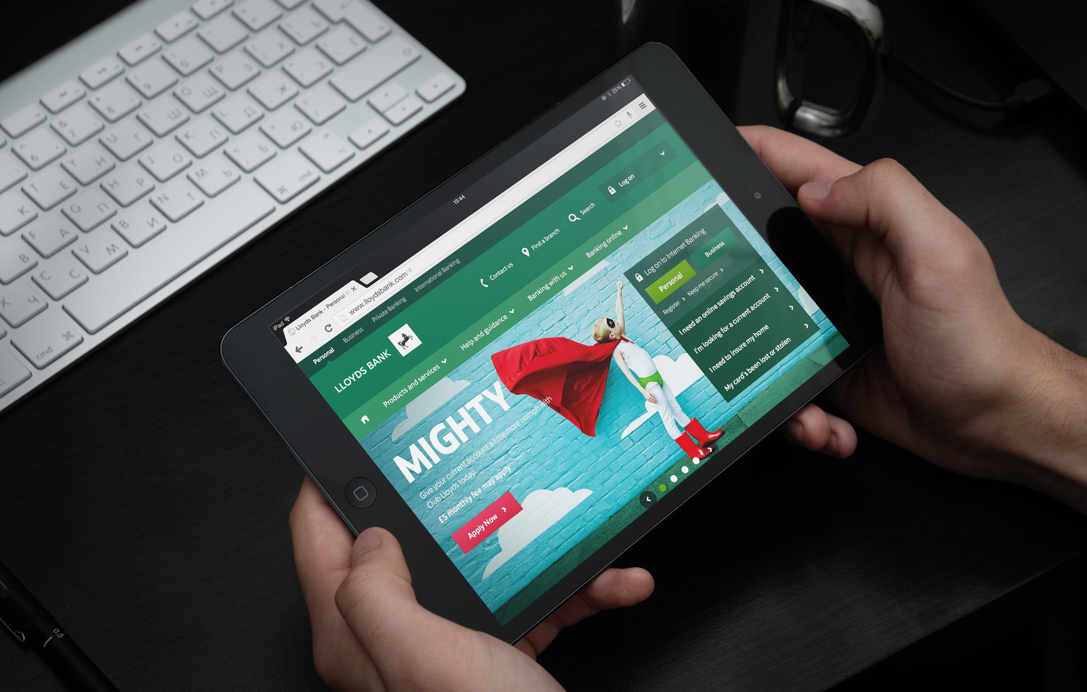
The site was designed within a responsive framework with adaptations to the user journey across mobile, tablet, and desktop devices. Our goal was to provide the optimum browsing experience while maintaining the primary features and site content regardless of form factor. We implemented a mobile-specific navigation, simplified the filtering system, and introduced touch and swipe gestures.
Building a scalable design system
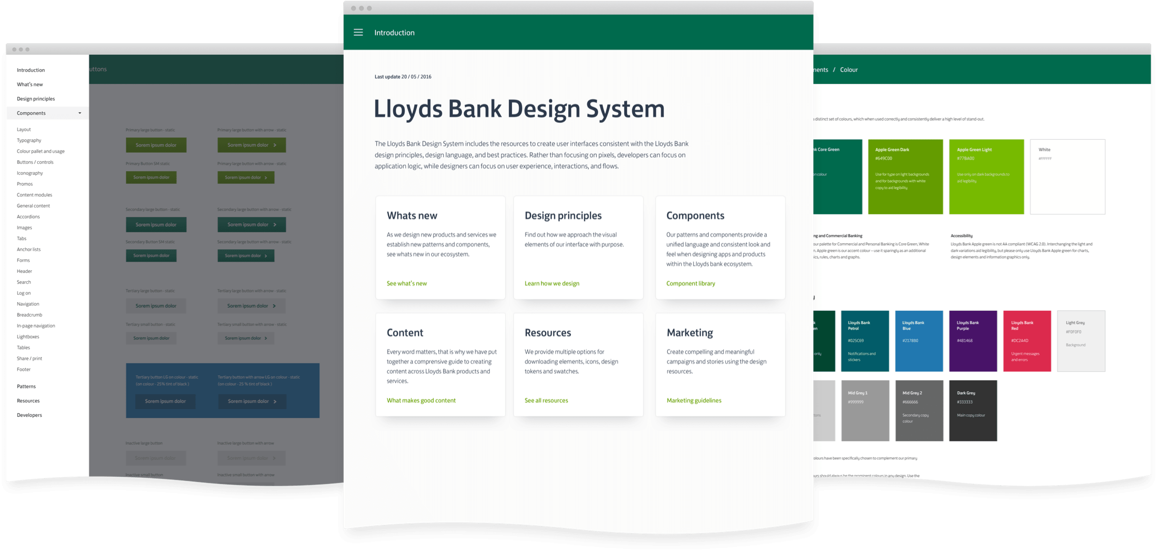
From the beginning we worked towards creating a scalable design system, as we designed new features and established new patterns we started to build a library of re-usable components that formed the building blocks of the experience.
The components were coded so that we had a single source of truth that everyone can refer to. The documentation also covered additional design principles and resources with the plan to add guidance for creating digital content and marketing collateral.
Next project

